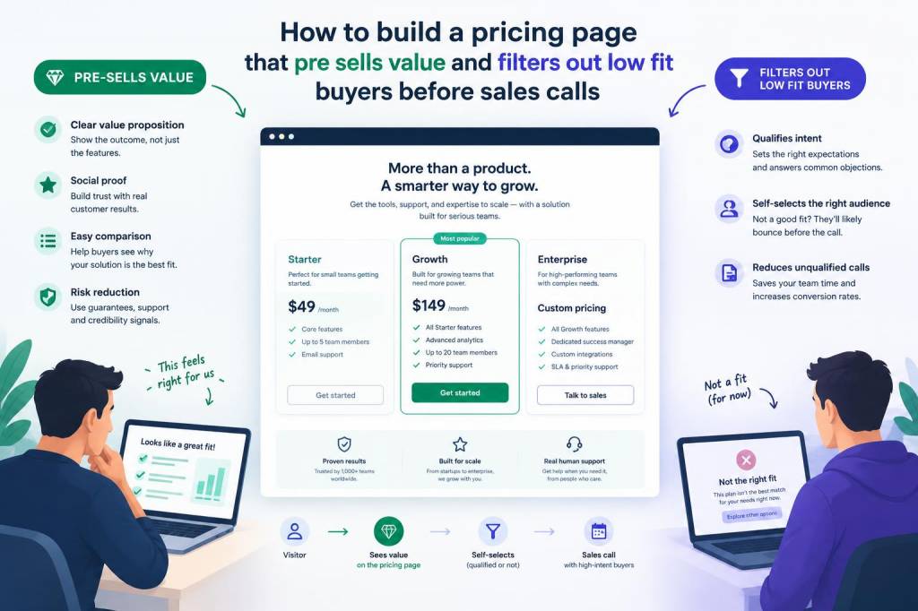
I learned early that a pricing page does much more than list numbers. It acts like a sales conversation before any call begins. When I build one, I want it to do two things at once: pre-sell value and filter out poor-fit buyers. If a visitor cannot understand why a plan costs what it costs, or cannot see themselves succeeding with it, they are not ready for a sales conversation anyway.
That is why I treat pricing pages as a qualification tool, not just a conversion asset. A strong page can shorten sales cycles, reduce wasted calls, and improve lead quality. It can also create trust, because it feels transparent instead of pushy. In my experience, the best pricing pages do not try to convince everyone. They help the right people say yes and help everyone else self-select out.
What I want a pricing page to do before a call
When someone reaches a pricing page, they already have some intent. They want clarity. They may be comparing options, checking whether a solution fits their budget, or trying to understand what is included. I use that moment to answer questions before they become objections.
A pricing page should do five things well:
- Explain value in plain language
- Anchor price against outcomes, not just features
- Show who each offer is for
- Make low-fit buyers feel safe leaving
- Make high-fit buyers feel confident booking a call
If a page only lists plans and a contact form, it usually creates friction. People hesitate because they cannot tell whether your offer matches their needs. A smarter page gives them enough context to qualify themselves.
I start with buyer fit, not price
Before I write any pricing section, I define the kind of buyer I want. That sounds obvious, but many teams start with packaging and end with confusion. I prefer to ask: who should move forward, and who should not?
For example, if I am selling a marketing service for fast-growing companies, I do not want to attract people who need one-off help and expect enterprise support. If I sell software, I do not want tiny teams who will churn after two months. The pricing page should make those differences visible.
I usually write down three profiles:
- Ideal fit: the buyer I most want on sales calls
- Possible fit: the buyer who may need more context or a lighter offer
- Poor fit: the buyer who will likely waste time on both sides
Once I define those groups, I shape the page around them. That means I choose language, proof, and package structure that speaks directly to ideal fit buyers while making poor-fit buyers self-filter.
I sell outcomes, then show structure
People do not buy a package of tasks. They buy a result they want and a risk they want to reduce. So I avoid opening with deliverables alone. I begin with outcome language that frames value in business terms.
Instead of saying, “Includes strategy calls, reports, and monthly support,” I prefer something like, “Built for teams that want a faster sales process, clearer pipeline visibility, and fewer wasted conversations.” That kind of wording tells a prospect what changes in their business.
After that, I show the structure that supports the outcome. I might break it into implementation, support, reporting, and review cadence. This sequence matters because value must come first. If I lead with structure before value, price feels heavier.
I use pricing as a signal, not a secret
People often hide pricing because they fear rejection. I understand that instinct, but hidden pricing usually attracts the wrong attention. If a visitor cannot see enough information to assess fit, they may book a call without real intent. That creates noise.
I prefer transparent pricing whenever possible. Even when exact numbers are not public, I still give a strong signal. That signal can be:
- A starting price
- A price range
- A “from” figure
- Clear package tiers
- Eligibility requirements
Transparency does not mean oversharing every internal detail. It means giving enough context so people can decide whether a conversation is worthwhile. That single shift can improve lead quality dramatically.
I add friction on purpose when it protects time
Most sales teams try to remove every bit of friction. I do not. I remove unnecessary friction, but I keep useful friction.
Useful friction helps filter low-fit buyers. For example, I may ask people to choose a company size, monthly budget, or core objective before they book. I may include short qualification copy near the call button such as: “Best for teams already generating consistent demand and ready to improve conversion efficiency.”
This is not meant to scare people away. It is meant to save everyone time. The right buyer sees the message and feels reassured. The wrong buyer sees it and realizes this is not for them. That is a win.
Words matter more than design in many cases
Design helps, but language does the heavy lifting. I have seen elegant pricing pages underperform because the copy was vague. I have also seen simple pages convert well because every line made the offer clearer.
My copy checklist usually includes:
- A simple headline that names the transformation
- A short paragraph that explains who it is for
- Plain-language package names
- Specific bullets for what is included
- Trust markers such as case studies or client logos
- Call-to-action text that matches buyer intent
I also avoid inflated language. Words like “premium,” “exclusive,” or “revolutionary” rarely help unless I can prove them. Specificity is more persuasive than hype.
I frame objections before they appear on a call
A pricing page is a good place to answer common objections early. If I know buyers usually worry about implementation time, hidden fees, or whether they will get enough support, I address those concerns directly.
For example, I may add a short section that says:
Common concern: Will this work for a small team?
Response: Yes, if your team is ready to implement quickly and has a clear owner for the process.
This approach does two things. It reassures ideal buyers and deters poor-fit leads. A person who needs a different level of support will recognize the mismatch sooner.
I use proof near price, not far away
If I want someone to accept a price, I need to support it with proof. Proof can come in many forms: testimonials, results, client counts, before-and-after metrics, or brief case studies. The placement matters. I want proof close to the pricing decision.
For example, I may place a short case study immediately below a package. If a plan looks expensive, proof helps explain why it works. If a plan seems affordable, proof still matters because it builds confidence.
I especially like proof that connects directly to business outcomes. Statements like “reduced sales cycle by 27%” or “improved lead-to-meeting conversion by 41%” are stronger than generic praise. Numbers make the value feel real.
I keep packages aligned with buying stages
Another thing I have learned is that not every buyer is ready for the same level of commitment. A pricing page can reflect that reality. I often build offers that map to different stages of maturity.
| Buyer stage | Need | Pricing page signal | Call outcome |
|---|---|---|---|
| Early stage | Clarity and quick wins | Entry offer, simple scope, limited support | Discovery, not deep implementation |
| Growing stage | Repeatable process | Mid-tier package, clear milestones, stronger support | Strategy plus rollout |
| Mature stage | Scale and optimization | Custom scope, eligibility notes, higher investment | Executive-level discussion |
This structure helps me avoid mismatched conversations. A small company does not need to think a custom enterprise package is their only option. At the same time, a larger buyer should not feel boxed into something too narrow.
I test for clarity, not just conversion
When I review a pricing page, I do not only ask, “Did it convert?” I ask, “Did it qualify correctly?” A page can generate many calls and still fail if the calls are unproductive.
Useful metrics include:
- Call-to-close rate
- Qualified lead rate
- Average sales cycle length
- Page scroll depth
- Clicks on pricing CTAs
- Questions asked during calls
If visitors keep asking basic questions that should already be answered on the page, that tells me the page is too vague. If very few people book calls, but those who do are strong fits, that may actually be a healthy sign.
I write for confidence, not pressure
The best pricing pages I build do not feel aggressive. They feel calm, clear, and selective. They make a promise, explain who belongs, and invite action without force.
That tone matters because buyers are sensitive to pressure. If a page feels manipulative, people hesitate. If it feels honest, they relax. And relaxed buyers make better decisions.
When I want a page to feel selective, I use phrases such as:
- Built for teams ready to move quickly
- Ideal for companies with an active demand engine
- Not a fit for very early-stage experiments
- Best suited for buyers who want hands-on support
These phrases are simple, but they do a lot of work. They protect my calendar and improve trust at the same time.
I design one page around one decision
If I could share one principle from years of doing this work, it would be this: a pricing page should support one clear decision. Not ten. Not three. One.
That decision is usually whether a visitor is ready to take a next step. Every element on the page should support that choice. When I keep that focus, the page becomes much stronger. It stops feeling like a brochure and starts feeling like a filter.
I have found that when pricing pages are built this way, sales calls become more productive. People arrive with better context, fewer false assumptions, and a clearer sense of fit. That makes every conversation easier to run and much more likely to lead somewhere useful.
If you want a pricing page that works harder for your sales process, start by making it honest, specific, and selective. Then make sure every line earns its place.